How to add Icon to Button in Squarespace 7.1
Want to make your Squarespace buttons more engaging and functional? Adding icons to buttons in Squarespace 7.1 is a fantastic way to enhance your design while improving user experience. Whether you’re highlighting a call-to-action or aligning your buttons with your site’s branding, icons can add clarity and style. In this guide, we’ll show you how to seamlessly integrate icons into your Squarespace buttons, even if you’re new to customizations!
Why Squarespace 7.1 Doesn't Support Adding Icons to Buttons Directly
Squarespace 7.1 lacks a built-in option to add icons directly to buttons, but you can easily overcome this limitation with custom code or creative design tweaks. By using pseudo-elements, you can seamlessly integrate icons into your buttons, enhancing both their visual appeal and functionality. In this guide, we’ll demonstrate how to achieve this using two primary pseudo-elements.
::after
::before
What Are Pseudo-Elements in CSS?
Pseudo-elements in CSS are special keywords that allow you to style specific parts of an element without needing additional HTML markup. They are incredibly useful for enhancing design and adding creative effects. Pseudo-elements are written after a selector, preceded by double colons (::), though the single-colon syntax (:) is still supported for older pseudo-elements for backward compatibility.
Common Pseudo-Elements:
::before
Adds content before the selected element.Example: Adding an icon or decorative text before a button label.
::after
Adds content after the selected element.Example: Adding decorative lines or symbols following a heading.
Key Features:
They don’t alter the HTML structure; the changes are purely visual.
Often used for effects like drop caps, icons, or additional decorative content.
Can be styled like any other element with CSS properties like color, font, and background
How to add icons to buttons in Squarespace 7.1 using a simple and effective method
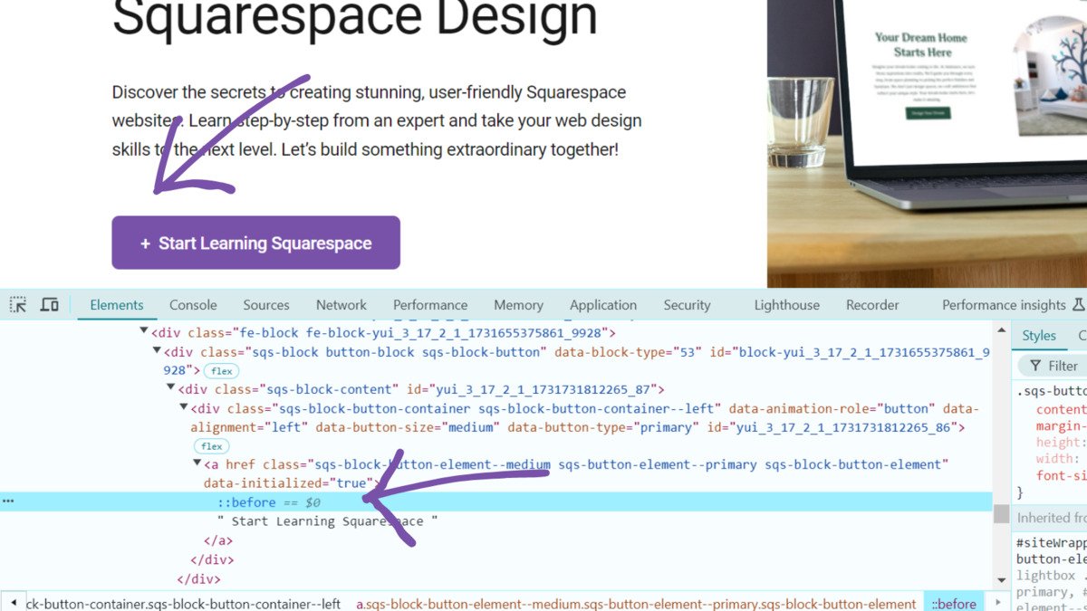
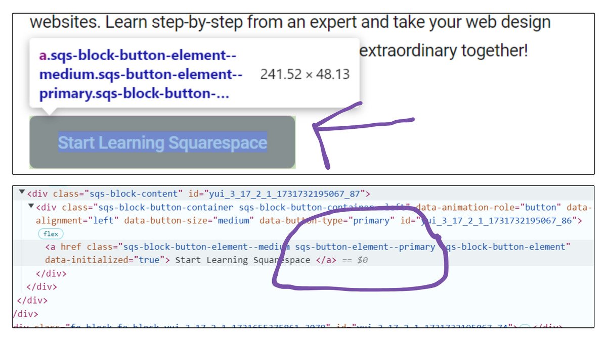
We'll use a CSS class selector to target the button and apply custom styles with pseudo-elements like ::before or ::after. We will use ::before for adding an icon on the left of the button and ::after for the icon on the right of the button text.
What are the Button CSS Class Selectors in Squarespace?
Squarespace offers three types of buttons: Primary, Secondary, and Tertiary. Each of these buttons is associated with a unique CSS class. Using these classes, we will add icons to the buttons accordingly. The classes associated with each button are:
‘sqs-button-element--primary’for the primary button‘sqs-button-element--secondary’for the secondary button‘sqs-button-element--tertiary’for the tertiary button
We will use these three class selectors for each button respectively, along with the pseudo-elements we discussed earlier.
How to add Icon to the primary button in Squarespace 7.1?
To add an icon to your primary button in Squarespace, you can use the following CSS code. This code targets the primary button using the .sqs-button-element--primary::after selector and inserts a plus icon right after the button text. Here's a breakdown of what the code does:
.sqs-button-element--primary::after {
    content: "+";
    margin-left: 0.25em;
    height: 1em;
    width: 1em;
    font-size: 1em;
}content: "+";adds a plus sign as the icon.margin-left: 0.25em;creates space between the text and the icon.heightandwidthdefine the size of the icon.font-size: 1em;adjusts the size of the icon to match the button text.
This will add a neat, visually appealing icon to your primary button in Squarespace.
How to add Icon to the Secondary button in Squarespace 7.1?
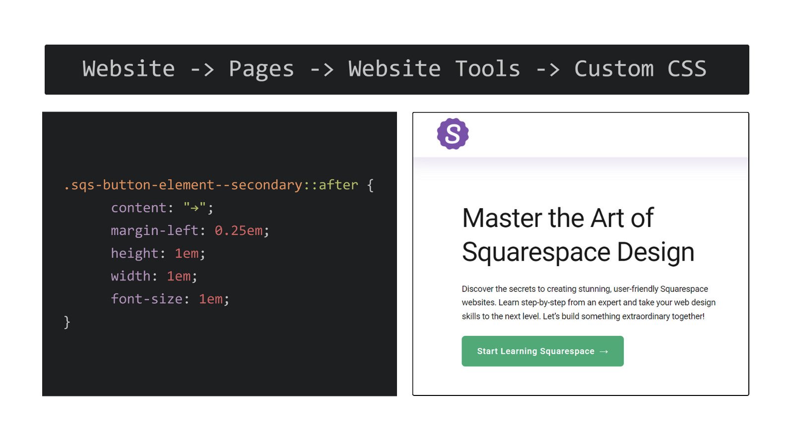
To add an icon to your secondary button in Squarespace, you can use the following CSS code. This code targets the secondary button using the .sqs-button-element--secondary::after selector and inserts an arrow icon right after the button text. Here's a breakdown of the code:
.sqs-button-element--secondary::after {
    content: "→";
    margin-left: 0.25em;
    height: 1em;
    width: 1em;
    font-size: 1em;
}content: "→";adds a right arrow icon after the button text.margin-left: 0.25em;ensures there is some space between the text and the icon.heightandwidthcontrol the size of the arrow.font-size: 1em;adjusts the size of the arrow to match the button's text size.
This code will add a clean, directional arrow to your secondary button in Squarespace, making it more engaging and visually interesting.
How to add Icon to the Tertiary button in Squarespace 7.1?
To add an icon to your tertiary button in Squarespace, you can use the following CSS code. This code targets the tertiary button using the .sqs-button-element--tertiary::after selector and inserts a star icon after the button text. Here's the breakdown of the code:
.sqs-button-element--tertiary::after {
    content: "⭐";
    margin-left: 0.25em;
    height: 1em;
    width: 1em;
    font-size: 1em;
}
content: "⭐";adds a star icon after the button text.margin-left: 0.25em;creates some space between the text and the icon.heightandwidthdefine the size of the star icon.font-size: 1em;sets the size of the star to match the button's text size.
This CSS will give your tertiary button a star icon, enhancing its appearance and making it stand out in your Squarespace design.
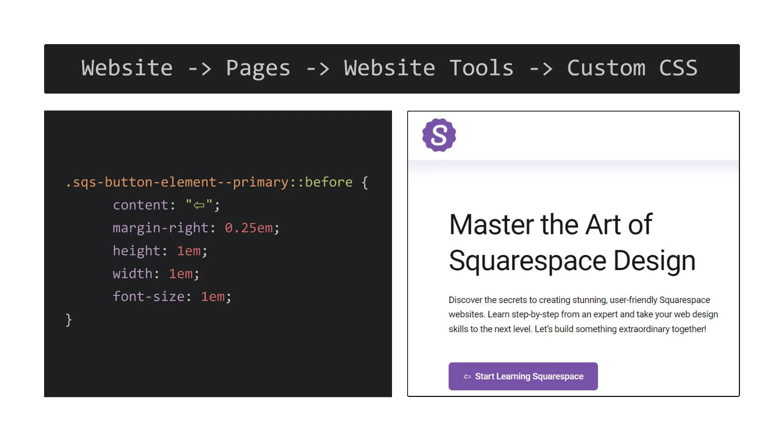
How to Add an Icon Before the Text in a Button in Squarespace 7.1?
To add an icon to the left of the text in your primary button in Squarespace, you can use the following CSS code. This code targets the primary button using the .sqs-button-element--primary::before selector and inserts a leftward arrow icon before the button text. Here's the breakdown of the code:
.sqs-button-element--primary::before {
    content: "⇦";
    margin-right: 0.25em;
    height: 1em;
    width: 1em;
    font-size: 1em;
}content: "⇦";adds a leftward arrow icon before the button text.margin-right: 0.25em;adds some space between the icon and the text to prevent them from being too close.heightandwidthdefine the size of the arrow icon.font-size: 1em;ensures the arrow icon matches the button text size.
This CSS will give your primary button a left-facing arrow icon, adding a visual cue and enhancing its look.
Adding icons to your Squarespace 7.1 buttons is a simple yet effective way to make your website more engaging and user-friendly. Even though Squarespace doesn’t have a built-in feature for this, you can easily add icons with a little custom CSS. By using pseudo-elements like ::before and ::after, you can place icons either before or after the button text. With unique CSS class selectors for primary, secondary, and tertiary buttons, you can customize each one to fit your site’s style. This quick and easy trick will help make your buttons stand out and guide your visitors more effectively.

